Stories worth investing in: energy-hungry Ai, measuring inflation, and what caused the 1929 stock market crash
Links for weekend reading: a petition supporting local energy prices, open plan offices and bad moods, and H5N1 on the loose
Programming note: There will be a short, one-week break from Friday, November 29th, to Friday, December 6th, inclusive. I'm away on business - the letters will take a breather for a few days.
Also, thank you for the wave of renewals over the last month. It's very much appreciated.
To those who haven’t renewed or are thinking about starting a subscription, hurry! On December 1st, I am increasing the annual rate to £60 from £50 and the monthly rate from £5 to £6.
Local energy pricing petition
If we’re going to even make a stab at net zero – an ambitious target by 2030, in my view – then one essential component of this transformation needs to be local energy pricing. As think tank Britain Remade points out, units of electricity are currently sold at exactly the same price regardless of where they’re generated. Moving to a system of local energy pricing, where the energy that’s generated close by is cheaper for local people and businesses, would:
Cut bills for everyone by reducing constraint payments
Put more money in the pockets of people who live nearest to where the energy is generated
Incentivise businesses to invest and create jobs nearby
They’ve launched an excellent online petition, which I’ve signed. If this floats our boat, sign here: https://www.britainremade.co.uk/cheaperlocalenergy
Factoids
Not all Japanese birth rates have collapsed. There are exceptions. On the Japanese island of Tokunoshima, fertility has been above the national average for years. Tokunoshima is home to Japan’s two highest fertility municipalities, with respective Total Fertility Rates of 2.25 and 2.24, in comparison with 1.2 for Japan overall. 45% of women aged 20-24 are married in Tokunoshima, in comparison with 7% nationally, and getting married after falling pregnant is normal and not stigmatized—that could be an important part of the story behind the island’s higher fertility.
A record high of 4.7% of South Korean babies were born outside marriage in 2023, compared with only 2.1% in 2013. For comparison, just under 40% of US babies are born outside marriage, 51% of babies in England and Wales, and 65% of French babies.
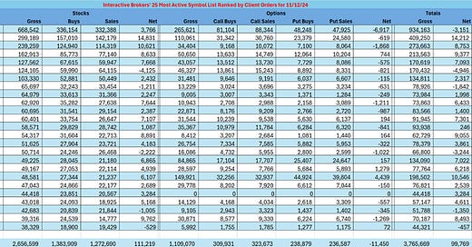
Interactive Brokers’ 25 Most Active Symbol List Ranked by Client Orders on the 12/11/2024
Note: The average stock order size for IBKR clients in October 2024 was 1,138 shares.
Open-plan offices put you in a bad mood. Open-plan office noise increased negative mood by 25 per cent and sweat response by 34 per cent (source). Compared with workers in cubicles, workers in open-plan offices had 62 per cent more days of sickness absence (source).
Look at this data set on enterprise-level survival and birth rates across selected economies. For start-up businesses in the UK, our birth rate is quite high, comparatively speaking internationally, but the survival rate is worryingly low.
Source: Codera Analytics
Charlie Morris on Team Internet
Charlie Morris of ByteTree runs an excellent newsletter aimed at identifying smaller company stocks, especially in the UK market. It’s called ByteTree Venture, and it's well worth subscribing to: you can read more about it HERE.
It's not really my area, but I do keep a watchful eye on interesting UK tech stocks in particular – they do exist, and a few might even be decent value! With that in mind, it is worth noting that Morris has been a big fan of a business called Team Internet, which is very Internet-based and really quite profitable. Morris first picked up TIG in September 2023, and although there was a subsequent rally, the share price has pulled back from the initial 128p to the current 89p, not helped by underwhelming third-quarter numbers.
At its core, Team Internet is a global internet solutions company focused on digital advertising and domain name management. Both of these are growth areas, although highly price-competitive. Team Internet is riding the digital wave in part by making well-timed acquisitions, such as the recent Shinez transaction. Morris reports that there has been a slew of instructional and wealth manager sellers of the stocks, many of whom were unimpressed by the CEO's presentation. Looking more specifically at the business, all the main business units seem to be doing fine.
“Presence - TIG is a high-quality and stable domain business. It makes approximately $20m per year and has room for cost cuts. It is worth between 10 and 15 times earnings, or $200m to $300m.
Comparison - TIG owns the VGL comparison site in Germany (best coffee machine, etc.). It is a growing business, making $15 million a year and would be worth around 10x earnings ($150m) in a trade sale.
The $280 million market cap is more than covered by these two businesses.
Marketing - TIG is the main subsidiary, including Shinez, which makes $60 million but is more cyclical and less predictable. They have exposure to Google and Instagram in a fast-moving market. The market has been concerned that volume increases have not kept up with price reductions. This division triggered a 10% downgrade for the Group. It makes $60 million but probably would fetch 5x ($300m) in a trade sale.
But what was missed in the results was this message from the board:
“Looking ahead, the Directors are committed to maximising value across the Group's asset base. We continue to enhance the revenue and profitability of our Online Presence business, which now contributes a substantial share of our overall profitability and operates under a subscription-based revenue model. The Board will continue to assess group structure to maximise Shareholder returns.”
The sum of the parts of TIG is $650 to $750 million against a $280 million market cap. AIM stocks don’t have the research, investor base and liquidity that main market stocks do, and as a result, severe mispricings can occur.
This is a growth company. I believe the recent shakeup will see the board take action, and we shall see what happens in their Q4 update. They have 129% upside on analysts’ forecasts.”
As I said, UK tech is not my focus but on a surface inspection, Team Internet seems interesting, trading on a forecast 4.6 times earnings, with an 11% return on capital employed, a forecast dividend yield of 2.6% and plenty of cash being churned out at the operating level (circa £75m). I suppose the big worry is the high level of borrowing with gearing above 100%. Its certainly worth some more detailed research.
What’s the impact of artificial intelligence on energy demand?
The latest energy scare story is that AI will eat the world's energy resources. This slight panic has induced a wave of private equity backed data centre operators doing deals with all manner of nuclear station operators, renewables firms and gas power plant owners.
Scary numbers are being introduced into the debate – that data centres running AI might end up using more than 10% (or more) of the world's energy output. I’m a little cagey about these scare stories, not least because if digital technology teaches us anything, it’s that engineers usually find a way around excessive power consumption. A useful exercise in panic management comes courtesy of Our World In Data’s excellent Hannah Ritchie, who writes a fab blog on the energy transition that is an oasis of thoughtful green-tinged analysis. Like me, she’s not convinced by the AI energy monster, asking first how much energy data centres and AI actually use today.
“A few percent of the world’s electricity, at most.
It’s not as easy to calculate this as you might think. Companies with data centres don’t simply report the electricity use of their servers, and we tally that up to get a total. Researchers try to estimate the energy use of these processes using both bottom-up and top-down approaches. While they come up with slightly different estimates, they tend to cluster around the same outcome.2
Data centres use around 1 to 2% of the world’s electricity. When cryptocurrency is included, it’s around 2%.
In its annual electricity report, published in January this year, the IEA estimated that data centres, AI and cryptocurrencies consumed around 460 terawatt-hours (TWh) of electricity. That’s just under 2% of global electricity demand.
You’ll notice that this figure is for 2022, and we’ve had a major AI boom since then. We would expect that energy demand in 2023 and 2024 would be higher than this. But not significantly more. As we’ll see in the next section, the IEA’s projected increase in demand to 2030 is not huge. So it must expect that the increase in 2023 and 2024 is even smaller.
Researcher, Alex de Vries, was one of the first to try to quantify the energy footprint of AI in the last few years.3 One way to tackle this is to estimate how much energy could be consumed by NVIDIA’s server sales. NVIDIA completely dominates the AI server market, accounting for around 95% of global sales.
De Vries estimated how much energy would be used if all of the servers delivered in 2023 were running at full capacity. It came to around 5 to 10 TWh; a tiny fraction of the 460 TWh that is used for all data centres, transmission networks and cryptocurrency.
Another way to estimate the bounds of energy use is to look at how much energy would be needed if search engines like Google were to switch to LLM-powered results. It’s thought that an LLM search uses around ten times as much energy as a standard Google Search (see the chart below).4
De Vries estimated that if every Google search became an LLM search, the company’s annual electricity demand would increase from 18 to 29 TWh. Not insignificant, but not huge compared to the total energy demand of data centres globally. One key thing to note is that this speed of transition for Google seems very unlikely, not least because NVIDIA would probably not be able to produce servers quickly enough. The production capacity of servers is a real constraint on AI growth.
Source: Alex de Vries (2024). The growing energy footprint of artificial intelligence.
While data centres and AI consume only a few percent of global electricity. In some countries, this share is much higher. Ireland is a perfect example, where data centres make up around 17% of its electricity demand. In the US and some countries in Europe, it’s higher than the global average, and closer to 3% to 4%. As we’ll see later, energy demand for AI is very localised; in more than five states in the US, data centres account for more than 10% of electricity demand.
While people often gawk at the energy demand of data centres, I think they’re an extremely good deal. The world runs on digital now. Stop our internet services, and everything around us would crumble. A few percent of the world’s electricity to keep that running seems more than fine to me.
How much energy could AI use in the future?
Of course, we don’t know. And I’d be very sceptical of any projections more than a decade into the future. Even five years is starting to get highly speculative. Last month, the International Energy Agency (IEA) published its latest World Energy Outlook report. It’s packed with interesting insights, but it was its projections for data centres that caught many peoples’ attention. They were, well, a bit underwhelming. The IEA published projections for how much it expected electricity demand to grow between 2023 and 2030. You can see the drivers of this increase in the chart below. Data centres made up just 223 TWh of the more than 6000 TWh total. It accounted for just 3% of the demand growth. Other things, such as industry, electric vehicles, and increased demand for air conditioning (and incidentally, more demand for heating) were much more important. Data centres were not much more than desalinisation, which I wrote about previously.
Source: IEA (2024). Covered by Ben Geman in Axios.
These projections are very uncertain. The IEA tried to put bounds on the sensitivity of these estimates by publishing “fast AI growth” and “slow AI growth” scenarios. In the chart below I’ve shown where these would rank. Even in the fast growth scenario, data centres don’t move up the list of the big drivers of electricity demand.
It’s worth noting that this is lower than the IEA’s earlier projections. And by earlier, I mean in January this year. In its 2024 electricity report, it thought that energy demand could double by 2026 (see below). The increase by 2030 would be even higher.
Source: International Energy Agency (2024). Electricity 2024.
You might wonder how these estimates can be so low when the demand for AI itself is booming. Well, the efficiency of data centres has also been improving rapidly.
In the chart below you can see the efficiency improvement in computer chips. It’s on a log scale. The energy intensity of these chips is less than 1% of what it was in 2008.
Source: International Energy Agency
More HERE
AI having an impact
Sticking with the AI theme, Exponential View’s Azeem Azhar points to yet more evidence that AI is already having an economic and business impact:
“Putting AI tools in the hands of R&D staff at a large unnamed US firm increased the amount of new materials discovered by 44%, the number of new patent applications filed by 39%, and the number of prototypes by 17%. R&D efficiency rose between 13-15%. This is huge. AI unlocked a new way of working: scientists could automate 57% of idea generation tasks to AI, better spending their time evaluating AI outputs for viable solutions.
Yet, there was a gulf in performance based on the researchers’ level of ability, which suggests that this is a co-pilot, not an autopilot. And, there’s more in scientific AI… AlphaFold3, which brought Demis Hassabis and John Jumper the Nobel Prize, just became significantly more efficient and was made available to researchers. Perhaps my favourite is Evo, a DNA-trained AI that excels at prediction and design at the level of DNA, RNA and proteins (first mentioned in EV#480). This could open the door towards creating life forms tailored to specific purposes. These strides are replicated across the field: Microsoft’s AI2MBD system for biomolecular dynamics simulation looks promising, while Google recently highlighted success in AI diagnosis of breast cancer.”
More HERE
H5N1 on the loose in North America
Now that Trump is imminently returning to power, it may be time for RFK Jr. to be tested with another viral outbreak. This is from CNN via the economic historian Adam Tooze. Buckle up…
“Canadian teen in critical condition with suspected bird flu; source of exposure is unknown The teen has been receiving care at BC Children’s Hospital in Vancouver since Friday, the same day an initial test came back positive for H5 influenza. Government testing confirmed that the strain is H5N1. The young person’s first symptoms, which began a week before they were hospitalized, were conjunctivitis or red eyes, fever and cough, said Dr. Bonnie Henry, an epidemiologist who is the provincial health officer for British Columbia. The illness has progressed to acute respiratory distress syndrome, or ARDS. People with ARDS typically need help breathing with machines such as a ventilator, but officials did not offer specifics on the teen’s treatment except to say they’re receiving antiviral medications. This is the first known human case of bird flu acquired in Canada. The country had one case in 2014, which was travel-related, Henry said. It is still unknown how the teen caught this strain of flu, which has been circulating widely in wild birds, poultry and some mammals, including cattle in North America since 2022.
Source: CNN
The history of inflation (data)
The brilliant Works in Progress online magazine has an excellent piece by Carola Conces Binder on the history of trying to measure inflation
“The government’s role in the collection and publication of price indexes has been politically controversial from its origins, which were surprisingly late. Wesley Clair Mitchell, the former president of the American Economic Association, in 1921 called it:
A curious fact that men did not attempt to measure changes in the level of prices until after they had learned to measure such subtle things as the weight of the atmosphere, the velocity of sound, fluctuations of temperature, and the precession of the equinoxes . . . Perhaps disinclination on the part of ‘natural philosophers’ to soil their hands with such vulgar subjects as the prices of provisions was partly responsible for the delay.
The first known price index was constructed by Count Gian Rinaldo Carli, an Italian professor and polymath, in 1764. Prices in Europe had been spiraling upward since the opening of trade with the New World. This ‘Price Revolution’, most notable in Spain and its neighbors, occurred with the inflow of large amounts of gold and silver. In Italy, many observers thought that prices were rising because Italy was getting richer as a result of accumulating gold from trade. To facilitate his study of rising prices, Count Carli collected prices of grain, wine, and oil from around 1450 and also from around 1755. For each commodity, he computed the percent change in price from the earlier to the more recent period. Then he took a simple average of those three percentage changes. This served as a basic measure of commodity price inflation. He did this using prices in terms of the Italian legal tender (lire), and then using prices in terms of gold and silver bullion. Prices in terms of lire had increased sharply, while those in terms of bullion rose only slightly. He concluded, therefore, that rising prices had resulted from the Italian government’s frequent debasement of the currency, rather than from growing wealth.
Governments around the world did not rush to adopt Carli’s methodology. Adoption came later, often driven by pressing circumstances. In the United States, one catalyst was the Civil War. To finance the war, beginning with the passage of the Legal Tender Act of 1862, the Union government began issuing paper money called greenbacks, unbacked by gold or silver. The greenbacks were the center of an intense debate about the constitutionality of paper money and the likelihood that it would lead to severe inflation. As the war progressed, Treasury Secretary Salmon Chase published rudimentary price indexes to demonstrate that, while high – prices roughly doubled during the war – inflation was not as bad as some feared.
Cost of living controversies
By the 1880s, labor unions were gaining strength and coming into frequent conflict with employers about whether wages were keeping up with price increases. Labor unions pushed for the creation of a government agency that could promote their interests. Employers, unsurprisingly, resisted. As a compromise, the Bureau of Labor was established in 1884, and was directed to simply collect and publish statistics about labor, without taking a particular stance.
The Bureau of Labor soon came to play an important role in the publication of price indexes. One impetus was the Republican Party’s McKinley Tariff of 1890, which sharply increased import duties in an attempt to protect American manufacturers from foreign competition. Labor activists claimed that the tariff had led to higher prices but lower wages. Senator Nelson Aldrich, a Rhode Island Republican best known for his role in the founding of the Federal Reserve, commissioned a committee to study whether this claim was true. His committee asked the Bureau of Labor to construct wholesale and retail price indexes from 1860 to 1891 – an effort that required collecting 52,393 price observations by hand. The committee’s report showed that prices had indeed risen after the tariff, but that wages had risen more than prices over a longer time period.
The bigger implication of the report was to demonstrate that it was feasible for a government agency like the Bureau of Labor to collect price data and publish price indexes. The report set a precedent for subsequent studies – studies which played a role in the important political debates about the monetary system in the 1890s. The return to the gold standard after the Civil War brought about a long period of deflation. This deflation was painful for farmers, who tended to be debtors, because it increased their real debt burden. In his famous ‘Cross of Gold’ speech at the 1896 Democratic Convention, the populist politician William Jennings Bryan advocated using monetary expansion to reverse the deflation and stabilize prices. Monetary expansion, he thought, could be achieved by monetizing silver or by issuing more greenbacks.
Around the turn of the twentieth century, the Bureau of Labor’s price index data allowed Progressive Era (1896–1917) economists – most notably Irving Fisher – to think for the first time about how in practice the government could stabilize prices in the economy if it wished to. Before Fisher’s work, economists used the Paasche index and the Laspeyres index to create price indexes. Both try to account for the fact that the quantities of each type of good consumed can vary from period to period, largely because when the relative price of a particular good rises, consumers reduce their consumption of it, but both indexes account for this varying consumption in a way that biases the resultant index.”
More at Works in Progress here.
What caused the market crash of 1929
The economic historian Jean-Laurent Cadorel has a paper out in the current edition of the Economic History Review looking at what caused the 1929 stock market crash in New York.
Surprise, surprise, it was a liquidity crash that dunnit !
Cadorel quantifies this liquidity crash by looking at the liquidation of brokers’ margin loans. Applying recent estimators of effective spreads and liquidity conditions from contemporary finance literature, the paper suggests a four-fold increase in spreads during the crash at the aggregate level. At the individual stock level, quoted bid-ask spreads suggest that liquidity explains one-fifth of the variance in daily stock returns during the crash.
By the way, if you’re feeling a tad smug and complacent about this happening again, I can easily see the growth of index-tracking exchange-traded funds prompting a liquidity mismatch in areas outside mainstream large-cap equities. Build a liquid structure on less-than-liquid assets, and you have a time bomb waiting to explode.
“This paper confirms the common wisdom that the 1929 crash was a liquidity crisis. At the aggregate level, proportional quoted spreads, Roll, Corwin and Schultz, Abdi and Ranaldo effective spreads, and the Amihud measure of illiquidity increased four-fold during the crash, while absolute quoted spreads increased three-fold. Zero returns is a common measure of liquidity, which was not tested, and it did not seem relevant because the crash is a case of illiquidity associated to an excess of trading and volume, rather than inactivity in financial markets. At the individual stock level, changes in quoted spreads explain a fifth of the variation in stock returns in repeated cross-sections and in panels, and point estimates suggest a 0.7–1.0 percentage point average decrease in daily stock returns for an increase of 1 percentage point in spreads when applying panel data models.
Since the 1929 crash appears to have been a liquidity crisis, and since we can quantify the decrease in liquidity at the aggregate level and link the decrease in liquidity at the stock level to negative stock returns, we can thus explain the crash by explaining the decrease in liquidity.
Some questions, however, remain, including, why is the explanatory power of liquidity so low? The crash represents a liquidity crisis, but liquidity across various measures only explains about one-fifth of the variance in stock returns. Charles E. Mitchell, president of National City Bank (now Citibank), and a coalition of bankers tried to support the market by publicly purchasing stocks at market prices, though they supported only some stocks. This behaviour brings up the question of whether it drove heterogeneity between stocks or across certain days. Rising heterogeneity between stocks over time might occur when bankers intervene in reaction to a crash to try to stabilize a market. Bankers were more likely to do so, first by buying their own stock and second by buying the highest quality stocks. Further, leverage is likely to have affected some stocks more than others, and severe deleveraging is likely to have taken place. Leverage is very much the other side of the coin of liquidity: by taking on leverage, investors create liquidity, beyond the capital they bring to invest.
A future avenue for research is perhaps to examine whether investment trusts, which are known to have taken on leverage, did so in specific stocks. A further research question is whether we can recover intradaily data for all stocks, instead of only the 80 I have found. How can we include stocks which became completely illiquid, without any bids or transactions? Part of the greatness of this crash is certainly due to the opaqueness surrounding it. Contrary to the Brady Commission for the 1987 crash, the Senate Commission and the Pecora Report did not answer the most pressing questions, but this study and hopefully following ones will progressively shed some light on the causes of the greatest crash of the twentieth century.”
More HERE (subscription required, but email me if you want a PDF of the paper).